Brand Design
2026
Kora Culture Co.
Kora House
Overview / The creative premise
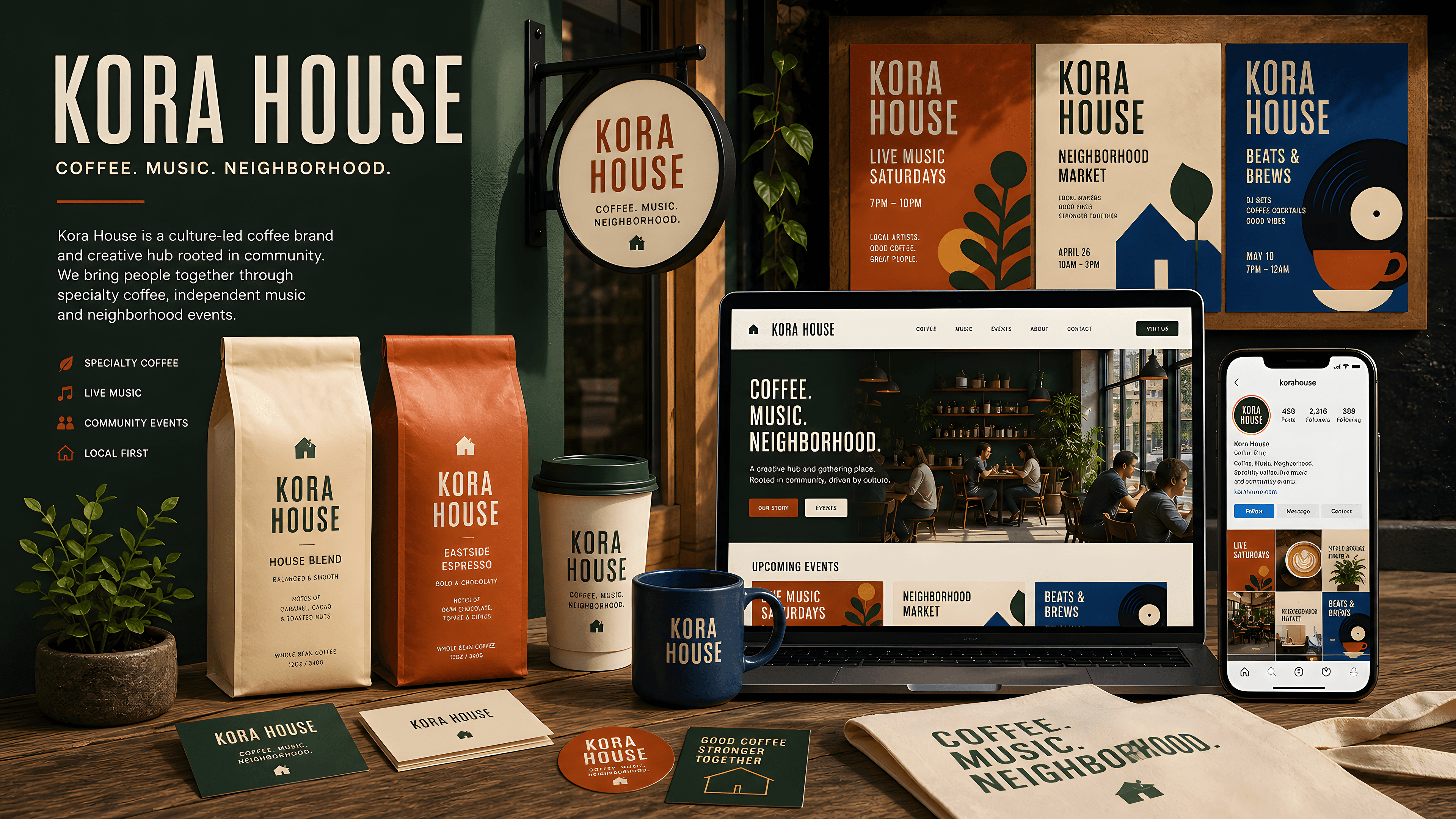
Kora House needed one recognisable system across physical spaces and digital touchpoints. We shaped the strategy, identity, campaign language, packaging, signage, and responsive website into a brand that feels cultural rather than corporate.
01 / 13
Problem
The business had strong programming and a loyal early audience, but every location, event, and product looked unrelated. Customers remembered individual moments without remembering the Kora name behind them.
02 / 13
Research
We interviewed guests, staff, artists, and retail partners, then mapped the journey from social discovery to venue visit and repeat purchase. The research identified rhythm, warmth, and local collaboration as the brand's strongest signals.

03 / 13
Solution

We created a flexible identity built around a distinctive wordmark, editorial typography, a violet-led palette, tactile image crops, and modular layouts. The same design language powers packaging, campaigns, signage, and a conversion-focused Framer website.
04 / 13
Challenges
The system had to feel expressive during campaigns yet remain practical for menus, event schedules, accessibility, and small internal teams. We tested every rule across print, environmental graphics, mobile screens, and low-light photography.

05 / 13
Feature 01

A modular brand toolkit gives each programme its own visual energy while preserving a consistent Kora signature across posters, packaging, social formats, and venue graphics.
06 / 13
Feature 02
The responsive website combines events, reservations, editorial stories, and shop content in a mobile-first structure with direct paths from discovery to action.
07 / 13
Feature 03
Editable Framer sections and reusable campaign templates allow the internal team to launch new events and products without rebuilding the visual system.
08 / 13
Feature 04
The booking and commerce journey connects event discovery, reservations, ticketing, coffee subscriptions, and limited object drops without breaking the editorial atmosphere of the brand.
09 / 13
Feature 05
A responsive motion toolkit turns programme data, sound, photography, and venue moments into campaign assets for social posts, digital signage, launch films, and event announcements.
10 / 13
Feature 06
A documented Framer component library gives the internal team editable page sections, accessible interaction patterns, and ready-made campaign layouts that preserve the Kora point of view.
11 / 13

12 / 13
Prototype
13 / 13
Key Takeaways
Brand consistency is not repetition. Kora became memorable by giving every touchpoint the same point of view while leaving enough room for culture and programming to change.