Web Design
04 May 2026
12 min read
Editorial rhythm makes websites memorable
Using hierarchy, pacing, motion, responsive composition, and CMS structure to make digital experiences feel deliberately edited.

Filed from the studio
An editorial website is not a magazine placed inside a browser. It borrows the intelligence of editing: deciding what arrives first, what needs space, where repetition creates recognition, and where interruption restores attention. The result can be restrained or visually intense, but every section should feel sequenced rather than stacked. Responsive design then translates that rhythm instead of merely shrinking it.
Begin with the reading order
Before designing components, we arrange the page as a sequence of attention. A visitor should understand what the organisation is, why the work matters, and where to move next without reading every sentence. Scale, position, contrast, and whitespace create this reading order. Large typography is useful when it carries a clear idea; it becomes decoration when every section competes at the same volume.
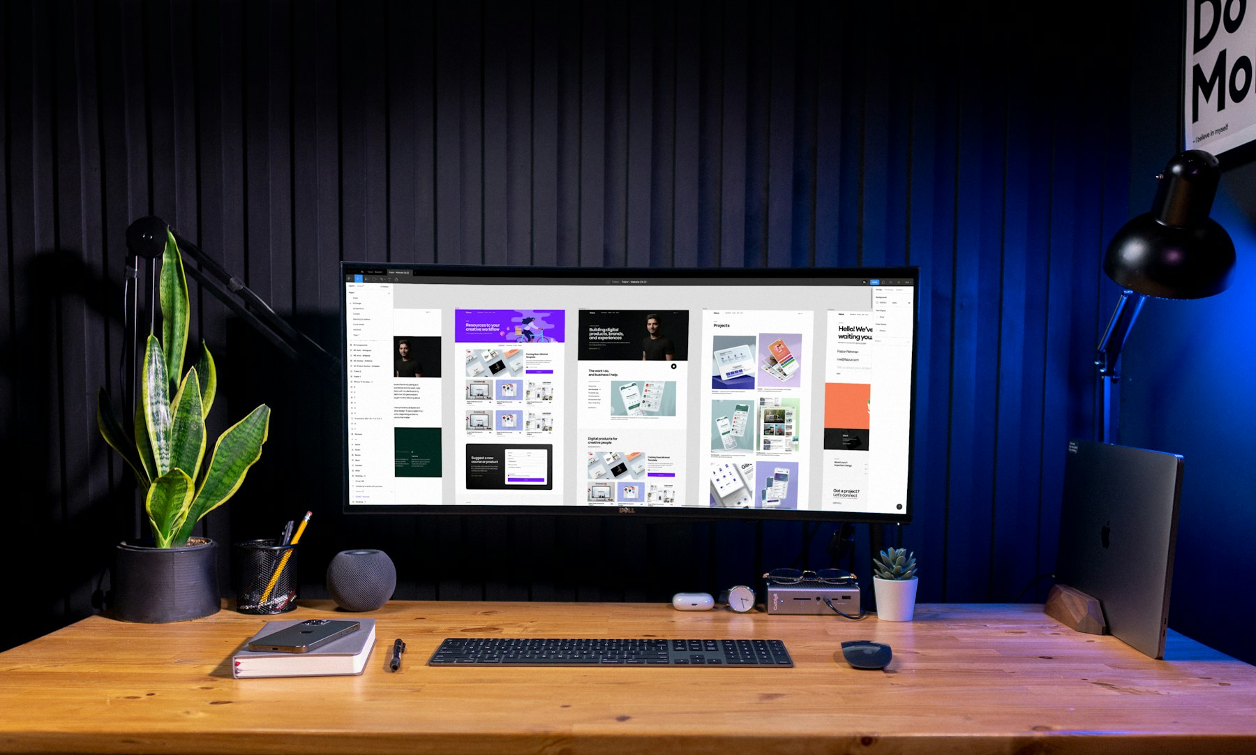
Responsive design is editorial translation
Desktop composition often depends on simultaneity: an image, label, headline, and annotation can share one field of view. A phone reveals those elements one after another. The mobile version therefore needs a new rhythm, not a compressed desktop grid. We reconsider order, cropping, type scale, spacing, interaction targets, motion distance, and the amount of information visible at each moment while preserving the same editorial point of view.
Use motion to clarify relationships
Animation should tell the visitor how the interface is organised. A shared transition can connect a project card to its case study. A restrained reveal can establish reading order. A responsive hover can acknowledge exploration without obscuring content. We use motion selectively, design reduced-motion alternatives, and test on real devices so the experience remains sharp rather than becoming a performance tax.

A CMS should preserve art direction
Content systems fail when editors must choose between flexibility and visual quality. We design CMS fields around actual editorial decisions: intentional cover images, meaningful categories, clear summaries, modular rich text, and repeatable media treatments. Templates provide structure, while carefully chosen variables give editors enough range to publish new work without creating a visually unrelated page every time.
Memorable web design is rarely one spectacular effect. It is the accumulation of precise decisions—how a title wraps, where an image enters, how quickly a section changes tone, and what remains quiet. When hierarchy and rhythm are strong, the site feels distinctive before the visitor can explain why.
Journal / Continue reading